Physio Flow is a telemedicine app for physical rehabilitation. The patient receives exercises from their own therapist as guided video, sees their schedule, joins the consultation from inside the app, and finds everything that was discussed in one place. The therapist no longer writes by hand during the session.


What is discussed in the clinic is forgotten by the time they get home: the posture corrections, which exercise to do and how many times, what to watch out for. The follow-up scatters across phone calls, messages and scraps of paper, and the patient has nowhere to see what is left to do. Without reminders, exercises get postponed, the pain returns, and another course of sessions follows.
I built the app around the two things that happen between sessions: training at home and staying in touch with the therapist. Exercises arrive as prescribed video, grouped into daily routines and levels. Appointments, the calendar and the video consultation live in the same system, and what was discussed stays written down, without the therapist interrupting the session to take notes.
The platform is designed as a rehabilitation ecosystem, not as an exercise app. This case study covers the patient experience; the therapist and clinic administration modules are designed as the next extensions.
Follows their video exercise programme, books and keeps appointments, talks to the therapist between sessions, and sees their progress and the recommendations they have been given.
Sees their assigned patients and the day’s schedule, prescribes personalised programmes delivered as guided video, and tracks how consistently the patient works between sessions.
Manages subscriptions and accounts, maintains the exercise library (categories, explanations, programmes) and sees how the clinic is doing at the level of activity.
Through a clinic. The patient is already registered there, the clinic grants access and assigns a therapist.
On their own. The patient subscribes themselves, picks a partner clinic and a therapist, then goes through an initial assessment, online or at the clinic.
After the assessment the route is the same: the therapist makes the diagnosis, builds the recovery plan, and the exercises, sessions and conversations all land in the app.
It was tempting to put a self-assessment questionnaire in the app: it would have shortened the path to the first exercise and made the product easier to scale. I chose not to. Rehabilitation conditions look alike on the surface and differ a great deal underneath, and an exercise prescribed on a wrong diagnosis is not neutral, it makes things worse. What you gain in speed you lose in safety, so the assessment stays with the therapist, and the app takes over everything that comes after it.
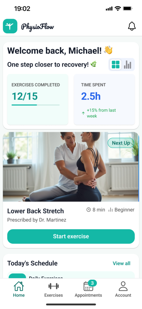
The first screen answers a single question: what do I have to do today. The week’s progress, the exercises coming up and the next session sit together, so the patient does not hunt through menus to find where they left off.
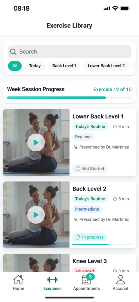
The exercises prescribed by the therapist, grouped into routines and levels. The screen distinguishes between what is still to start, what is in progress and what is finished. That distinction is what keeps the patient consistent, not the list itself.
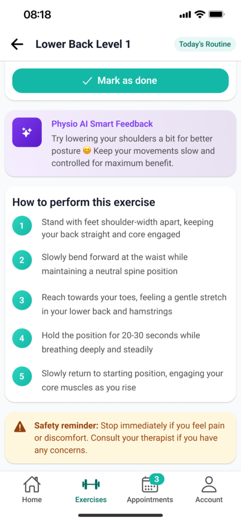
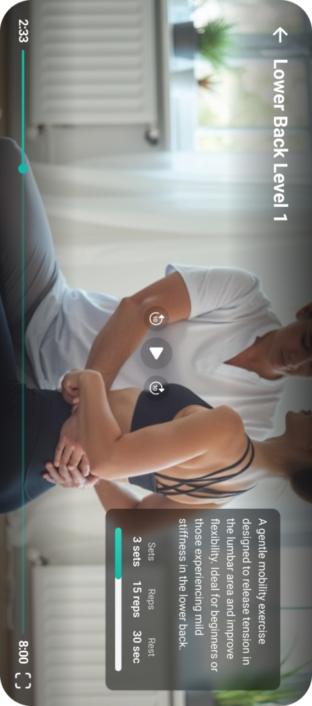
Every exercise follows a guided video, with step-by-step instructions and a timer that keeps track of sets, repetitions and rest. The patient does not count and does not wonder whether they are doing it right. They watch and perform.
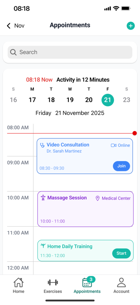

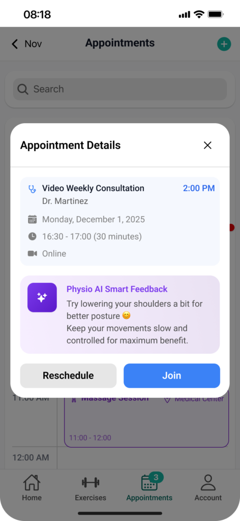
The calendar has two views, for two different questions. The day, as a timeline, answers “what is next”. The month gives the overall picture. From either one the patient opens the session details (type, therapist, format, time) and joins the video consultation directly or reschedules it.
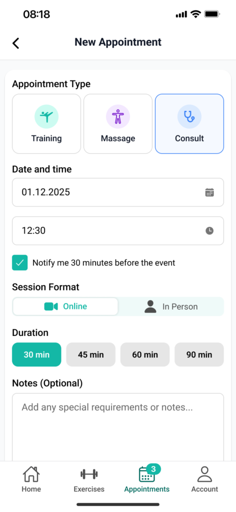
A guided flow, not an empty form: session type, date, format, duration, reminders and, optionally, a note for the therapist. Every step has a sensible default, so booking finishes in a few taps.
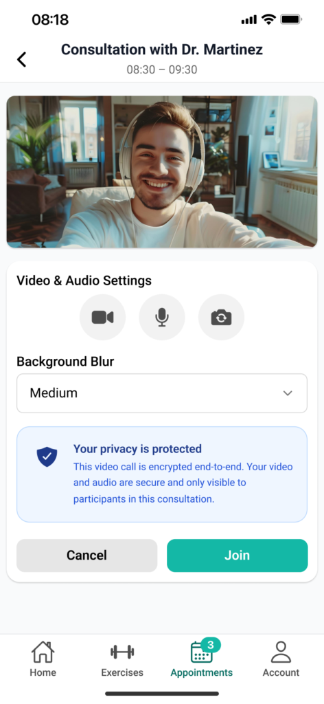
The preparation screen exists so the first two minutes of the session are not lost to “can you hear me?”. The patient sees their camera, checks the microphone, blurs the background if they are at home, and reads what happens to the data from the consultation.
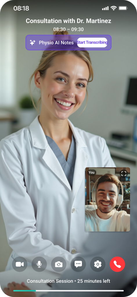
The consultation happens inside the app, with no external links. During it, the therapist can start the note-taking assistant, which captures the important points without interrupting the conversation. After the session, the notes and the conversation stay in a message area attached to the consultation. That is where follow-up questions continue, and where the recommendations can be found again the following week.

The interface is built on Ionic 8, on native iOS components. In a medical app used daily by people who do not come from tech, the gestures and patterns they already know from their phone are worth more than an original interface.
The patient app is fully designed. Next come the therapist module (assigned patients, schedule, prescribing programmes, tracking adherence) and clinic administration, with subscriptions, accounts and the exercise library. The ecosystem was designed for all three from the start, so the patient side does not have to be rewritten when the rest is added.

UXFACTS SRL · CUI 51977507 · J2025042846007 · Str. Vasile A. Urechia nr. 23, Iași, județul Iași